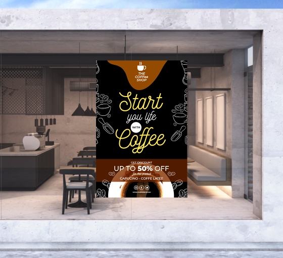
Window graphics are a popular way of raising brand awareness for owners of small businesses and stores. By using window graphics, store owners can transform an otherwise boring piece of real estate into a vibrant and compelling brand and sales promotion vehicle. However, for window decals to have the desired impact, they need to be designed properly. Some tips on getting the design of window graphics right:
 |
| How to Design Your Window Decals for the Best Impact |
Decide Which Option Is Best for You
You can use window cling films that are not only very thin but do not need any adhesives for fixing. It gives them the advantage of being moved and adjusted for the best placement. Window decals are typically thicker, have adhesive on one side, and cannot be repositioned once fixed.
Another popular choice is a perforated
sticker that allows you to see outside from within the store, but passersby can
only see the graphics and not inside your store. It is also possible to give
your windows a frosted look with the help of frosted stickers. They have the
advantage of ensuring privacy, making the space inside more cozy, adding
sophistication to your store appearance while elegantly boosting your brand
visibility.
Get Your Decal Sizes
Right
One of the key things
to get your window sticker right is measuring it accurately and developing a
size-appropriate design. Make sure that the placement of the business logo and
the text is such that they are optimally visible and legible. Decals for full
window coverage should reach the edges for a proper fit without gaps for a
clean and professional appearance. You should design the sticker, keeping in
mind the size of the windows, the number of panels, the architecture of the
building, the need for privacy, and the typical viewing distance.
Choose the Most
Optimal Color Scheme
You need to ensure that the color scheme resonates with your brand colors for better synergy. Also, you should ensure that the text is in a color that has high contrast with the background to make it easy to read at a glance. The psychology of colors is also an important factor because certain colors evoke certain feelings in viewers.
Blues and greens are peaceful and environment-friendly colors, while
red is interpreted as vibrant and spontaneous but sometimes aggressive. White
is considered sophisticated and elegant. According to Entrepreneur, the
perception of color changes with the audience demographics, which is why it is
important to know your target audience.
Window graphics have two main components, images, and text. While you must use graphics and the color scheme carefully to catch the attention of people passing by, you need to stay true to your brand color palette and personality to build brand awareness and recollection better.
Any text in the display must be as crisp as possible, contain no ambiguities, must have a powerful CTA, and above all, be easily readable. To make a design that works, you must take into account factors like the size of the display, the height it is positioned at, the distance from which it will be viewed, and the lighting.

No comments:
Post a Comment
Please Leave a Comment to show some Love ~ Thanks